5 Best Replit Alternatives in 2026: My Honest Experience Testing AI App Builders
Quick comparison: the best Replit alternatives I tested
The list below covers the five tools I tested directly, with Replit included as the benchmark product.
Tool | Best for | Starting price | First impression |
Replit | Users who want an all-in-one AI coding and app-building platform | Free; Core from $20/month or $18/month billed annually
Pro from $100/month or $90/month billed annually | Feature-rich builder with strong planning visibility and practical product depth, but weaker reliability and visual alignment than the top group |
Manus AI | Users who want a broader autonomous agent, not just a browser builder | From $20/month | More than an app builder, but slower than the rest in this test |
Lovable | Fast, beginner-friendly vibe coding with clear product logic | Free; Pro from $25/month | Very easy to use and one of the quickest to generate a convincing app |
Vercel v0 | Design-forward web apps and strong visual quality | Free; Team from $30/user/month | Minimal interface, but one of the best outputs overall |
Base44 | No-code full-stack app building with bundled infrastructure | Free; paid plans from $16/month billed annually | Practical, complete, and strong on operational detail |
Hostinger Horizons | Beginner-friendly app building with bundled hosting simplicity | From $6.99/month billed annually | Easiest commercial packaging, but the weakest output in this test |
I did not want this to become another generic list of Replit alternatives that just repeats feature pages, pricing tables, and broad claims about what each tool can do. I wanted to see what actually happens when you give several AI app builders the same job and ask them to create something that feels like a real consumer product. That matters because people searching for alternatives for vibe coding, are looking for a tool that fits the way they want to build now, whether that means faster iteration, better design, less technical setup, or a more complete product experience.
So I tested each tool with the same prompt. That was enough to expose the gap between a tool that can produce a decent-looking interface and one that can generate something more believable and product-ready. What I found is that the best Replit competitors are not all solving the same problem. Some are stronger at full-stack completeness while others are more beginner-friendly.
How I tested these Replit alternatives
To keep this fair, I gave each tool the same product brief. I did not want one builder to get an easier prompt than another, and I also did not want to rely on templates or preselected themes unless there was no practical way around them.
Test prompt used across all tools:
Build me a personal finance tracking website for everyday users. Include a dashboard with total income, total expenses, remaining budget, savings progress, and monthly spending insights, a transactions page where users can add, edit, delete, and categorize income or expenses, a budgets page with monthly category limits, and a goals page for savings targets and deadlines. Include charts for spending trends, filters by category and date, recurring expenses, overspending alerts, realistic sample data, and a responsive layout that works well on desktop and mobile.For the design, I want a modern fintech style that feels premium, calm, and trustworthy. Use a clean layout with rounded cards, soft shadows, generous spacing, and a navy, white, and emerald or teal color palette. Add subtle hover effects and polished interactions, but keep the interface easy to read. It should look like a real consumer product, not a generic admin panel, wireframe, or boring corporate template.
This was a good benchmark because it tested both design quality and product logic. It had to produce charts, budgets, transactions, savings goals, and flows that felt coherent for everyday users.
What I evaluated | Why it matters for this search intent |
Design quality | People searching for AI app builder tools usually want something that already looks close to launch-ready |
Feature completeness | A good Replit alternative should handle more than a single dashboard screen |
Ease of use | Many readers looking for no-code Replit alternatives do not want heavy setup or technical friction |
Overall product feel | The best tools make the result feel like a real web app, not just a concept mockup |
Replit as the benchmark
Replit is still one of the better tools for vibe coding because it sits in that middle ground between an AI app builder and a more complete browser-based development workspace. It does not just try to give you a pretty first draft. It also tries to give you planning, debugging, publishing, previews, and a more active sense of building inside a working environment. That matters, because if I am comparing other tools to Replit, I am not just comparing visual outputs. I am comparing how convincingly each one can take a natural-language product brief and turn it into something that feels like a real app.
Using the tool and navigating it
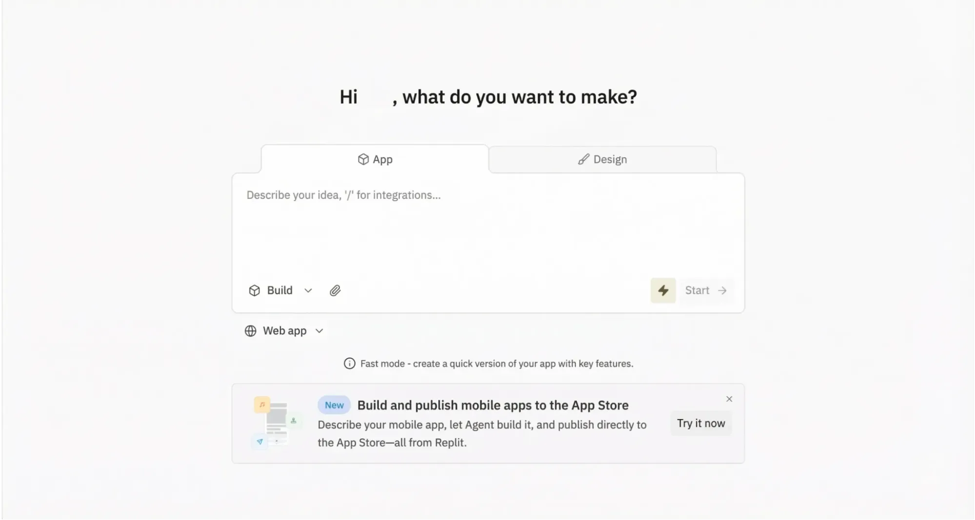
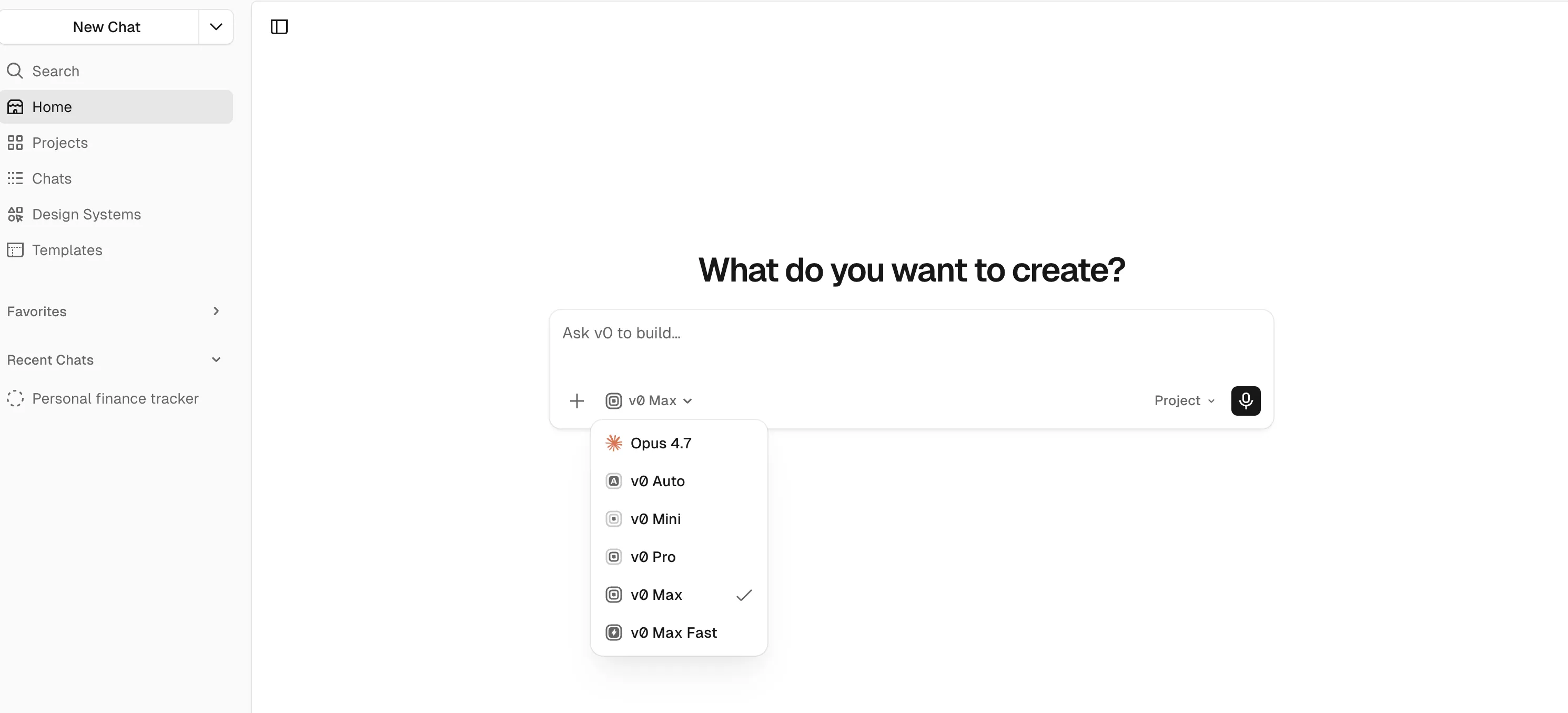
When I opened Replit, the first thing I noticed was how simple the interface felt despite how much was actually packed into it. The main prompt box sat in the center, recent projects were visible below, and there were pill-style options for different kinds of outputs like websites, spreadsheets, slides, and data visualizations. It immediately felt familiar in the way a lot of modern AI products do, but Replit also had more depth behind that first screen. Beyond the prompt box, Replit included planning tools, imports, and other workflow features. It felt approachable, but clearly built for more than just quick prompts.
That is also part of why I think Replit makes sense as a benchmark. It is one of the more complete vibe-coding experiences in the market right now. It gives a useful baseline for judging the others because it combines AI generation with actual product workflow features. If another tool performs better in certain aspects, the difference should come from a smoother experience, stronger polish, or better alignment with the brief, rather than from an easy comparison.
The output
Replit took about sixteen minutes to build the personal finance app, which made the experience feel more like a real app-generation workflow than a quick mockup. I liked being able to watch the agent work through the build, but the first version did not open cleanly and threw an error before I could properly test it. Having to use the built-in debug flow before interacting with the product hurt the overall impression. It showed real capability, but not a fully smooth path from prompt to usable result.
Once it was running, though, the app matched the brief reasonably well at the product level. It included the main sections I expected: Dashboard, Transactions, Budget, and Goals. The core functionality was also solid. The dashboard surfaced balances, income, expenses, budget usage, charts, and recent activity in a sensible way. The strongest detail was the recurring transaction feature. I could set transactions to repeat daily, weekly, monthly, or yearly, which made the app feel closer to a real consumer finance product than a shallow demo. The budget and goals flows were also clear, with progress tracking that was easy to understand.
The weaker area was the visual polish and interaction reliability. Replit picked up some of the prompt's design cues, such as rounded corners, soft shadows, and a clean layout, but it did not really deliver the premium fintech look I had asked for. The palette leaned more generic black and white than navy, white, and emerald or teal, and the result felt usable rather than distinctive. A few top-bar elements also looked clickable without actually doing anything, which made the experience feel less finished. Publishing was relatively smooth, but overall Replit came across as capable and structurally strong, with enough rough edges to keep it from feeling fully polished.
How well did it perform?
Category | Assessment |
Design | Clean and modern, but only partially followed the premium consumer-fintech brief |
Following instructions | Strong on core structure and product logic, especially around dashboard, budgets, goals, and recurring transactions |
Usability | Good once fixed, but the initial error and a few non-working interface elements made the experience less smooth |
Price | Free tier available, with more advanced workflow features tied to paid plans |
My honest take
Replit is still one of the stronger vibe-coding tools I tested, which is why I used it as the benchmark for this comparison. It can turn a natural-language prompt into a real working product and did especially well on recurring transactions and overall app structure. But it was not especially smooth, and it was not fully faithful to the design brief. That makes it a useful benchmark: credible enough to set a real bar, but imperfect enough to show where smoother, more design-sensitive, or more focused alternatives can pull ahead.
The 5 best Replit alternatives I tested
1. Manus AI: The best all-around alternative if you want an AI agent, not just an app builder
Manus is the least direct one-to-one Replit replacement in this list, but it is also the one with the broadest upside. Officially, Manus is positioned as an autonomous general AI agent that can plan, execute, and deliver work in a sandboxed environment with tools, internet access, and persistent files, rather than only acting as a narrow prompt-to-code generator.
Using the tool and navigating it
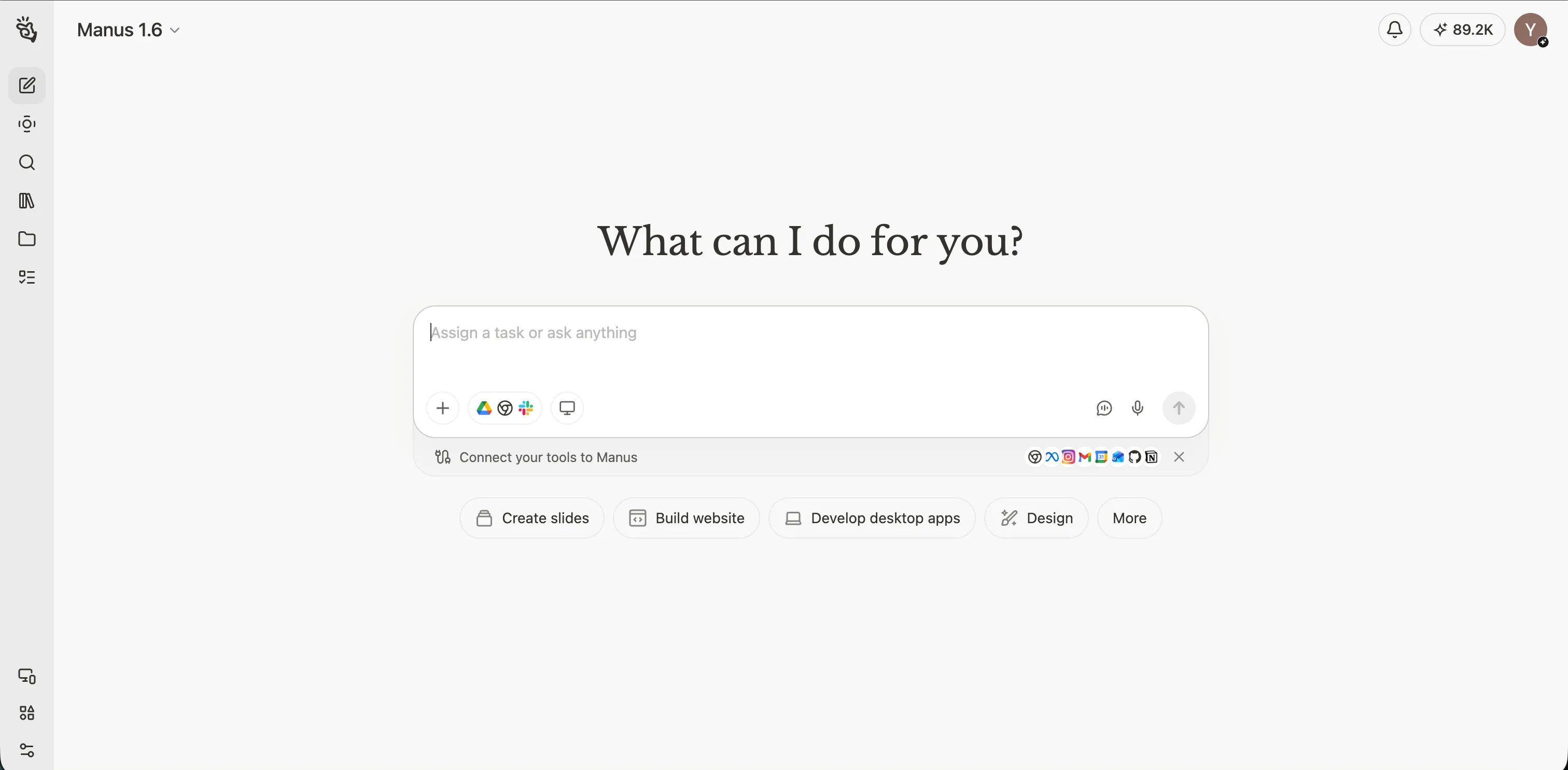
The builder experience felt broader than a dedicated website-only product because the interface clearly framed Manus as a general AI agent rather than a pure app generator. The prompt box was still front and center, so entering the task through plain text remained straightforward, but there were more surrounding controls than in some of the narrower vibe coding tools. In practice, that did not make the tool hard to use. It just made the environment feel more feature-rich and slightly less single-purpose to me.
The output
Manus took much longer than the other tools in this test, at roughly 40 minutes, and it used 763 credits to generate the result. The extra time did translate into a product that felt relatively polished and product-shaped. The generated site did not feel like a loose collection of pages. It felt like a coherent personal finance experience with a clear consumer orientation.
It was one of the stronger matches to the premium, calm, and trustworthy side of the prompt.
The site used a clean fintech palette, rounded cards, soft shadows, and generous spacing in a way that felt more consumer-oriented than admin-like. More importantly, what surprised me is that the tone and information architecture worked together really well. The dashboard, transactions, budgets, and goals sections all felt organized around what an everyday user would actually want to understand: where their money stands, what is recurring, what may be over budget, and how savings goals are progressing.
The main weakness was interaction precision rather than structural incompleteness. The prompt asked for polished interactions and a consumer-product feel, and Manus mostly delivered that at the layout level, but some hover states or chip-like elements appeared more clickable than they really were, and the brand navigation could have communicated home-link behavior more clearly. The overall transaction flow felt strong, but edit and delete actions were less explicit than the rest of the experience. Hence, the product shape was strong to me but a few prompt details around interaction clarity were still only partial.
How well did it perform?
Category | Assessment |
Design | Strong premium fintech direction, calm palette, and a more consumer-oriented feel than a generic internal dashboard |
Following instructions | Very good coverage of dashboard, transactions, budgets, goals, recurring expenses, alerts, filters, and sample data |
Usability | Highly usable overall, though some clickability and hover behavior could be clearer |
Paid plans start at $20/month, with higher tiers at $40/month and $200/month |
My honest take
Manus understood both the structure and the tone of the brief very well. It was not the fastest tool here however this could perhaps be due to other apps and tasks running in the background of my device. But it still produced one of the more polished, consumer-facing outcomes in the set, with the main remaining issues sitting in interaction clarity rather than feature coverage.
2. Lovable: The smoothest Replit alternative for fast vibe coding
Lovable is one of the clearest direct answers to the search for building sites with natural language if what you want is a generation-first workflow. Officially, it is positioned as an AI app builder for apps, internal tools, and prototypes, with pricing that emphasizes collaboration, custom domains, and team-friendly features.
Using the tool and navigating it
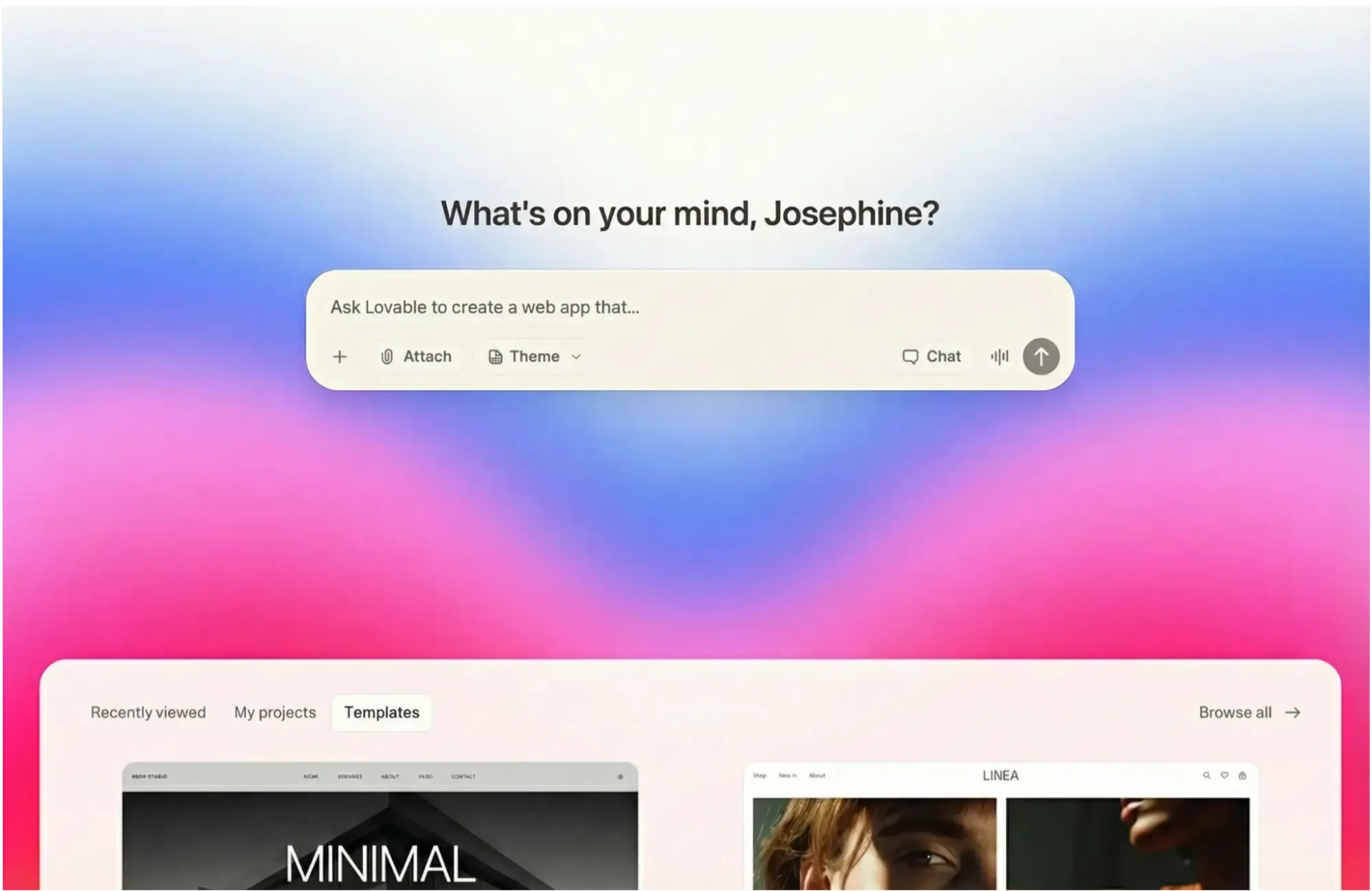
Lovable offered one of the most approachable builder experiences in the set. The prompt box was central, the interface was easy to understand, and optional theme choices or templates were visible without getting in the way. That made the starting experience really smooth and friendly to me while still allowing a fair prompt-only test.
The output
Lovable took about five minutes to generate the site, and the result was immediately understandable. The generated finance tracker was strong in clarity, usability, and conventional product logic. It covered the requested dashboard, transactions, budgets, and goals structure well and felt coherent across those areas. The site also included sample data, charts, recurring-expense logic, overspending signals, and management flows such as adding transactions or creating goals, which was a really nice touch.
Where Lovable was slightly weaker was in the emotional layer of the prompt. The prompt asked not just for a usable finance tracker, but for a premium, calm, trustworthy consumer-finance product. Lovable got the structure right, but that visual interpretation felt more partial in my opinion. The product came across as dependable and practical, yet more like a clean SaaS-fintech application than a distinctly premium consumer-finance brand. It was credible and usable, but less memorable than the strongest visually led builds.
How well did it perform?
Category | Assessment |
Design | Clean and modern, but more SaaS dashboard than high-end consumer fintech |
Following instructions | Very strong coverage of requested pages, features, sample data, and management flows |
Usability | Excellent; one of the easiest products here to understand immediately |
Price | Free plan available; Pro starts at $25/month and Business at $50/month |
My honest take
Lovable understood the structure of the brief strongly and the aesthetic of it only partially. The result felt product-ready in a practical sense, and if someone likes the idea of Replit's AI app-building direction but wants a smoother and more obviously beginner-friendly vibe coding flow, Lovable remains one of the strongest options in this list.
3. Vercel v0: The best Replit competitor for design-forward web apps
Vercel v0 is best understood as a design-aware AI app builder that sits close to the Vercel ecosystem. Its official pricing and product language emphasize full-stack web app creation, visual Design Mode, deployment to Vercel, and collaborative iteration.
Using the tool and navigating it
v0 provided one of the simplest prompt-entry experiences in the group of tools I am testing. The interface was minimal and easy to understand, with fewer surrounding controls than some of the other builders. That simplicity reduced friction, even if it made the environment feel a little plainer and less expressive at the builder level.
The output
Their output was one of the strongest in the whole test. The v0-generated finance tracker combined consumer-friendly polish, clear financial structure, realistic data, recurring-expense visibility, overspending awareness, and credible add flows for both transactions and goals. It felt approachable rather than cold, and its use of rounded cards, soft shadows, and a clean fintech layout helped it feel like a real consumer finance app.
What made it especially convincing for me is that it did not rely on visual polish alone. The transactions flow visibly supported recurring entries, the goals flow supported both creation and contribution, and the budgets page clearly surfaced over-budget and near-limit states. The biggest opportunity was not structural correction but further distinction. The prompt asked for a premium, calm, trustworthy fintech product rather than just a competent finance dashboard, and v0 delivered most of that well, but the brand personality still felt a little less distinctive than the very best consumer-product interpretations. Some management affordances were also present more by implication than by loud, explicit interaction cues.
How well did it perform?
Category | Assessment |
Design | One of the strongest visual results; modern, calm, and clearly closer to the requested premium fintech direction |
Following instructions | Strong coverage across all core sections and several of the requested supporting features |
Usability | Very good, though a few management actions could be surfaced more explicitly |
Price | Free plan available; Team starts at $30/user/month and Business at $100/user/month |
My honest take
v0 understood both the structure and the practical user experience of the brief extremely well. It was one of the most convincing results overall because it felt polished, usable, and balanced rather than merely visually impressive to me.
4. Base44: The best Replit alternative for full-stack completeness without much setup
Base44 positions itself as an AI app builder that can create fully functional apps in minutes, with bundled backend, authentication, database functionality, analytics, and integrations already built into the platform. That official positioning lines up closely with how it felt in practice.
Using the tool and navigating it
Base44 presented itself clearly as a build-oriented environment. The prompt field was central, and the presence of project-type options and a planning mode made the tool feel tailored to app creation. Even without using those extras, the interface communicated that it was designed for structured product building rather than casual experimentation.
The output
Base44 took about five minutes to generate the site, and the result was one of the strongest entries in terms of visible functionality and product completeness. It had a convincing dashboard, a large and realistic transactions ledger, clear budgets, multiple savings goals, and visible creation flows. It felt populated, credible, and active.
Its tradeoff was that it expressed the brief more successfully at the level of functional product logic than at the level of premium emotional identity, which disappointed me a little. The prompt asked for recurring expenses to be visibly supported and for the overall experience to feel premium, calm, and consumer-fintech. Base44 met the structural side strongly, but those parts felt more partial. The interface was clean and trustworthy, yet it leaned toward a solid dashboard language rather than a distinctively elevated consumer-fintech tone, and recurring expenses felt more implied than clearly foregrounded. The branding inconsistency between FlowFin and Finora on the site also weakened the sense of finish.
How well did it perform?
Category | Assessment |
Design | Clean and modern, but more function-first than emotionally distinctive |
Following instructions | Excellent feature completeness and strong operational credibility |
Usability | Very good, it is one of the easiest outputs to treat as a working product rather than a concept |
Price | Free plan available; Starter from $16/month, Builder from $40/month, Pro from $80/month, and Elite from $160/month billed annually |
My honest take
Base44 understood the prompt structurally very well and delivered one of the most complete products in the set. If I cared more about completeness and practical workflows than premium visual warmth, it would be one of the easiest tools here to recommend.
5. Hostinger Horizons: The most beginner-friendly bundled alternative, but the weakest performer in this test
Hostinger Horizons is positioned as an AI website and app builder for turning ideas into web apps without writing code, with hosting, analytics, and other go-live conveniences bundled around the product. That commercial simplicity is part of the appeal, especially for small-business users.
Using the tool and navigating it
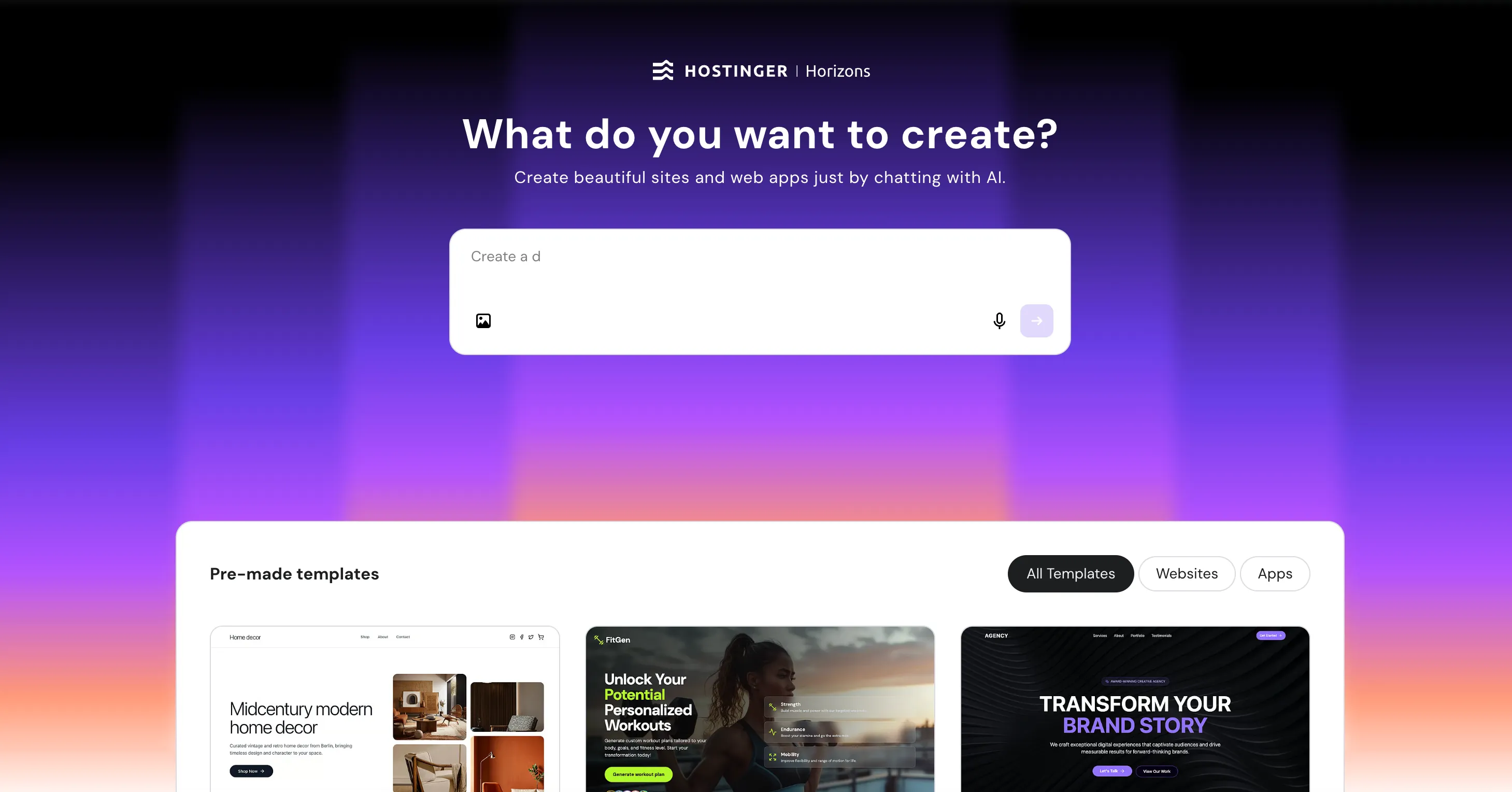
Hostinger's builder interface looked visually different from the rest. It used a more colorful starting point, offered many premade templates below the prompt box, and kept the prompt-entry experience fairly simple. The loading experience also tried to guide the user by surfacing tips while the build was running, which was a thoughtful touch.
The output
Unfortunately, the build flow itself was unstable which was a letdown. The generation process produced errors, had to be retried, and then crashed again. This made me a little frustrated during the process. Once the app loaded, the result was functional in parts but clearly less convincing than the stronger builds. The dashboard felt simpler and more minimalistic, and some quick-action buttons on the main screen redirected back to the homepage instead of behaving as expected.
Despite that, it was not unusable. I could still add transactions or goals by going into their dedicated pages directly, and parts of the product shell remained workable. But the prompt asked for more than a usable shell. It asked for charts, category and date filters, recurring expenses, overspending alerts, realistic sample data, and a premium, trustworthy fintech feel. Because the build was unstable and several visible interactions were broken, multiple prompt requirements remained partial or unclear rather than confidently demonstrated. In a finance context, that matters more than it would in a casual demo because broken controls and inconsistent behavior weaken trust quickly.
How well did it perform?
Category | Assessment |
Design | Simple and minimal, but less aligned with the requested premium fintech direction |
Following instructions | Partial; the core structure appeared, but the product felt less complete and less reliable |
Usability | Mixed; still workable in places, but crashes and broken quick actions hurt confidence |
Price | Plans start at $6.99/month billed annually, with higher tiers for more AI credits and features |
My honest take
Hostinger still showed that it could generate a usable product shell, and the interface around prompting was easy enough to approach. But the prompt asked for a polished, trustworthy consumer product, not just a partially working shell. Because stability issues and broken quick actions made several requested behaviors feel partial or unproven, it came across as meaningfully less product-ready than the stronger alternatives in this comparison.
Final verdict on the best Replit alternatives
If I were writing a purely theoretical roundup, I could say all five tools deserve a place on a list of best Replit alternatives and leave it there. But after actually testing them on the same personal finance app prompt, the differences felt more concrete than that.
If your priority is a smooth vibe coding workflow with quick, practical output, Lovable is one of the strongest picks. If you care most about front-end quality and a result that already feels like a believable consumer product, Vercel v0 is excellent. If you want a more complete full-stack feeling without stitching together too much infrastructure yourself, Base44 is a compelling option. If you want the simplest commercial package for a beginner-oriented path to launch, Hostinger Horizons is understandable, although it was clearly weaker in this specific test.
The most interesting outlier is Manus. It is not the closest clone of Replit, and it is not the fastest builder here. But if what you really want is not just another AI app builder, but a broader AI teammate that can help across planning, research, execution, and delivery, it has the widest ceiling. That is why Manus is the tool in this list that feels most like a step forward into a broader AI workflow, rather than just a lateral swap.
FAQ
What is the best Replit alternative overall?
If you want the broadest all-around AI workflow, Manus is the most ambitious option in this list. If you want the cleanest direct vibe coding experience, Lovable and Vercel v0 are the strongest choices based on this test.
Which Replit alternative is best for beginners?
Lovable is the most beginner-friendly option in this test because it is clear, fast, and immediately usable. Hostinger Horizons is also beginner-oriented in product packaging, though its output was less reliable in my test.
Which Replit alternative is best for design quality?
Vercel v0 delivered the strongest balance of modern visual design, consumer-facing polish, and product credibility in this comparison.
Which Replit alternative is best for no-code or low-code full-stack apps?
Base44 is the clearest answer if you want a no-code Replit alternative with backend, data, authentication, and app logic bundled more tightly into the builder.
Should I choose a direct Replit competitor or a broader AI agent?
That depends on what you are replacing. If you want a similar prompt-to-app building experience, tools like Lovable, v0, and Base44 are closer. If you want a broader AI system that can help with more of the surrounding workflow, Manus is a stronger fit.
