What is Data Analysis & Visualization?
Manus transforms raw data files into polished visual insights without requiring spreadsheet expertise or manual chart creation. Upload your data, describe what you want to learn, and Manus handles the analysis, creates professional visualizations, and delivers results in your preferred format, slides, reports, dashboards, or webpages. Manus performs actual analysis, identifies patterns, extracts insights, and presents findings in a format ready for client meetings, executive presentations, or strategic decision-making.Quick Start
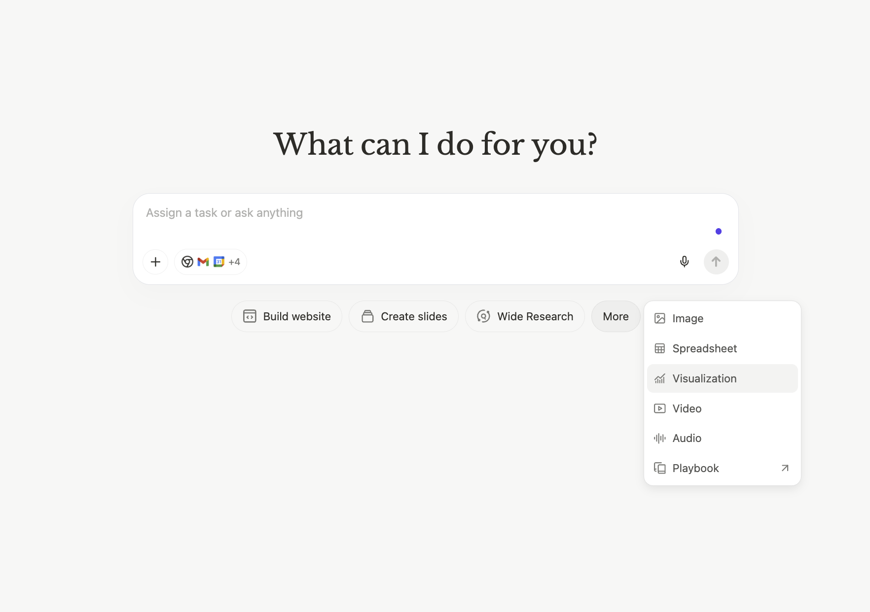
- On the manus.im main page, click on More > Visualization
- Upload Data: Provide your data file (CSV, Excel, or other formats). This could be sales data, customer surveys, market research, financial records, or any structured dataset.
- Describe Your Analysis: Use natural language to explain what you want to understand. Examples: “Identify growth opportunities and key metrics,” “Compare performance across regions,” “Find patterns in customer behavior.”
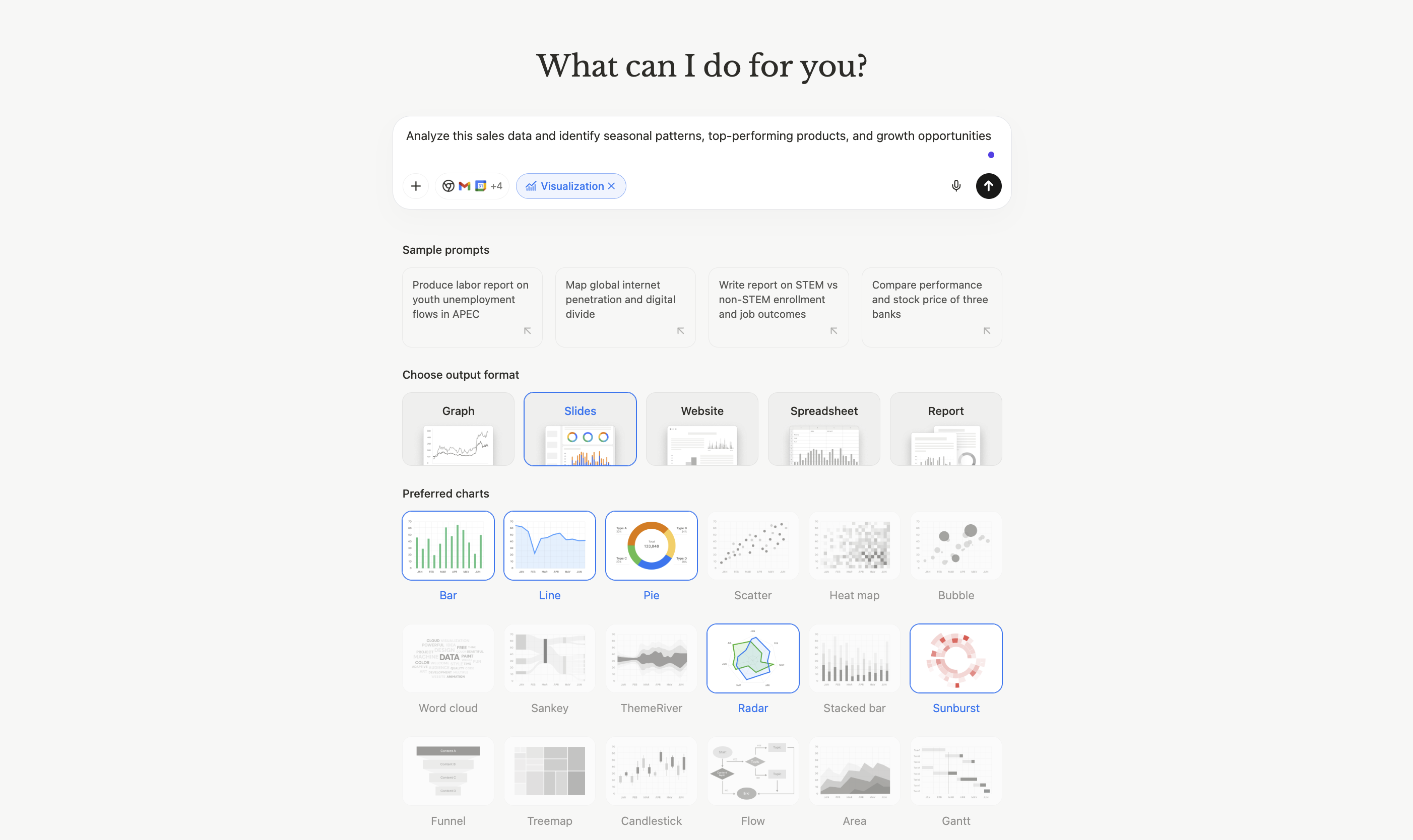
- Choose Output Format: Select how you want results delivered—slide deck, interactive dashboard, detailed report, or standalone webpage. Manus generates professional, presentation-ready output with charts, insights, and key findings.
Market Trend Analysis
Customer Segmentation
Request: “Segment these customers by behavior and create profiles for each group” Data: Customer purchase history, demographics, engagement metrics Output: Interactive dashboard with scatter plots showing customer clusters, pie charts for segment distribution, and detailed profiles for each customer typeCompetitive Benchmarking
Request: “Compare our metrics against competitors and highlight where we lead or lag” Data: Performance metrics from 10 companies in the industry Output: Report with radar charts showing multi-dimensional comparison, bar charts for individual metrics, and strategic insights about competitive positioningVisualization Options
Manus supports a comprehensive range of chart types, allowing you to select up to five different visualization styles for a single analysis. This ensures your data is presented in the most effective format for your audience.| Chart Type | Best For |
|---|---|
| Bar Charts | Comparing values across categories, showing rankings |
| Line Charts | Displaying trends over time, showing growth patterns |
| Pie Charts | Illustrating proportions and percentage breakdowns |
| Scatter Plots | Revealing correlations and relationships between variables |
| Heat Maps | Showing intensity patterns across two dimensions |
| Radar Charts | Multi-dimensional comparisons, competitive analysis |
Output Formats
Slide Decks
What You Get: Complete presentation with title slide, executive summary, individual charts with insights, and conclusions. Best For: Client presentations, executive briefings, team meetings, investor updates. Features: Professional design, speaker notes, export to PowerPoint, ready to present.Interactive Dashboards
What You Get: Web-based dashboard with multiple visualizations, filters, and interactive elements. Best For: Ongoing monitoring, team collaboration, self-service exploration. Features: Real-time updates, clickable charts, responsive design, shareable link.Detailed Reports
What You Get: Comprehensive document with methodology, findings, visualizations, and recommendations. Best For: Strategic planning, documentation, detailed analysis, audit trails. Features: Professional formatting, citations, export to PDF, full context.Standalone Webpages
What You Get: Public or private webpage with visualizations and narrative. Best For: Sharing with external stakeholders, embedding in websites, public reporting. Features: Custom branding, responsive design, no login required, permanent link.Real-World Use Cases
Sales Performance Analysis
Customer Survey Insights
Market Research Compilation
Financial Trend Monitoring
When to Use Data Analysis & Visualization
Ideal For:- Preparing presentations from raw data
- Client meetings requiring visual insights
- Executive briefings and board reports
- Market research synthesis
- Performance reviews and KPI tracking
- Customer behavior analysis
- Competitive benchmarking
- Financial reporting
- Real-time data streaming (use static datasets)
- Highly specialized statistical modeling (use dedicated tools)
- Data that requires extensive cleaning (clean first, then analyze)
- Exploratory data science (better suited for structured questions)
Tips for Effective Data Analysis
Be specific in your request:- ✅ “Identify seasonal patterns in sales and recommend inventory adjustments”
- ❌ “Analyze this data”
- Trends over time → Line charts
- Category comparisons → Bar charts
- Proportions → Pie charts
- Correlations → Scatter plots
- Multi-dimensional → Radar charts
- Presenting to executives → Slide deck
- Ongoing monitoring → Dashboard
- Documentation → Report
- External sharing → Webpage
- Include column headers that are self-explanatory
- Remove unnecessary columns before upload
- Ensure dates are formatted consistently
- Clean obvious errors first
- Use Wide Research to gather competitive data, then visualize it
- Create analysis in Data Viz, then embed in Web Development project
- Generate charts, then include in Slides for comprehensive presentation
Common Questions
What data formats does Manus accept?
What data formats does Manus accept?
PDF,CSV, Excel (XLSX, XLS), and other common structured data formats. The data should be organized in rows and columns with clear headers for best resultes
Can I analyze multiple datasets at once?
Can I analyze multiple datasets at once?
Yes. You can upload multiple files and request analysis that combines or compares them.
How many charts can I create in one analysis?
How many charts can I create in one analysis?
You can select up to 5 different chart types for a single analysis, ensuring comprehensive visualization of your data.
Can I edit the charts after they're created?
Can I edit the charts after they're created?
Yes. You can request modifications: “Make the bars wider,” “Change colors to match our brand,” “Add data labels to the pie chart.”
Does Manus handle data cleaning?
Does Manus handle data cleaning?
Manus can handle basic data preparation, but for best results, ensure your data is reasonably clean before upload. Remove obvious errors and ensure consistent formatting.
Can I export the visualizations?
Can I export the visualizations?
Yes. Depending on output format, you can export to PowerPoint (slides), PDF (reports), or access standalone webpages with permanent links.
How does this compare to Excel or Google Sheets?
How does this compare to Excel or Google Sheets?
Manus focuses on insight generation and presentation-ready output, not manual data manipulation. It’s faster for creating polished visualizations but not a replacement for detailed spreadsheet work.
Can I use this for real-time dashboards?
Can I use this for real-time dashboards?
The current version works with static datasets. For ongoing monitoring, you can re-run analysis with updated data files.